Echoes of Colonisation
Data Visualisation | Storytelling | 2024
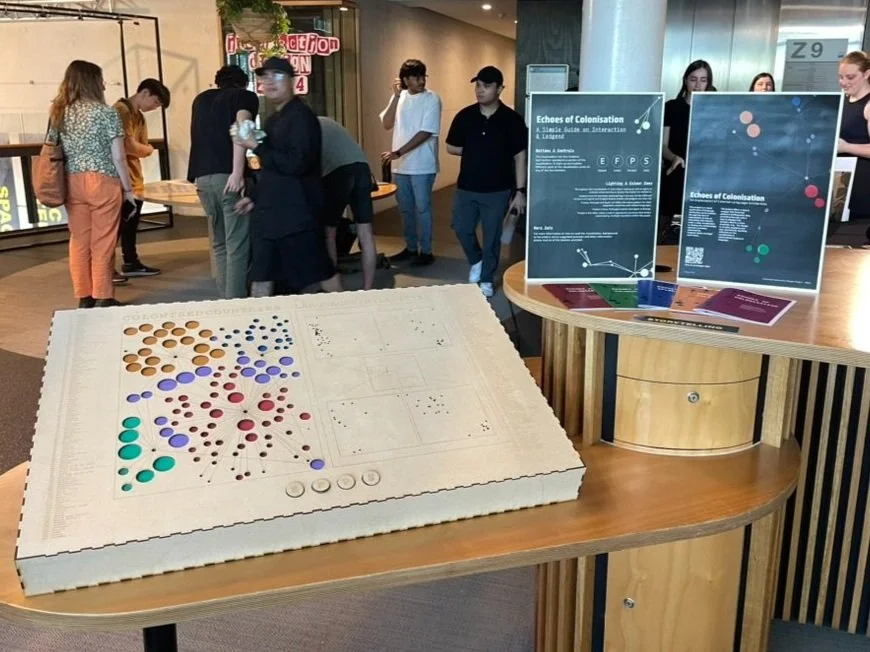
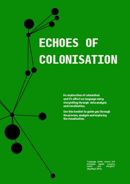
This project is a visual exploration of language similarities across nations through the lens of colonisation. It uses an interactive LED network under a data visualisation to display the relationships between countries colonised by England, Spain, Portugal and France.
The project offers a way to engage with historical patterns and linguistic data, providing the user with a way to engage with complex data in a simplistic way

This project aimed to bridge the gap between data and storytelling, providing audiences with a thought-provoking way to explore how language reflects colonisation's cultural and historical legacy. The project offers a way to engage with historical patterns and linguistic data, providing the user with a way to engage with complex data in a simplistic way.
The design is tactile, visually engaging and also educational, sparking reflection on the complexities of colonisation’s legacy on language. It utilises academic datasets as well as one built specifically for the project. It uses an interactive LED network under a data visualisation to display the relationships between countries colonised by England, Spain, Portugal and France.
The physical setup displays two graphs: a network graph which shows connections between colonisers and colonised, and a stylised Principal Component Analysis (PCA) scatter plot demonstrating the linguistic similarities between colonisers and colonised nations.
The user can activate different LEDs to explore how countries were colonised by multiple empires or observe the linguistic proximity of their languages. The user uses the different buttons to explore different areas of the graph and to observe different relationships.
The Process
The creation of Echoes of Colonisation involved:
Reseach
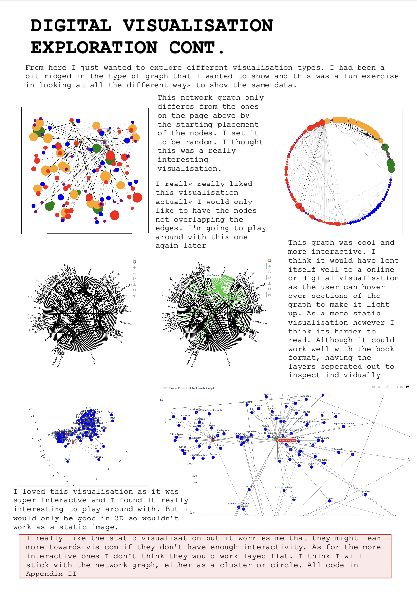
Collecting linguistic and historical data to analyse patterns of colonisation and language similarities. The research phase included exploration of different types of data visualisations as well as physically interactive installations. Types of projects used for inspiration were interactive museum installations, online interactive data analysis and infographic design.
Prototyping
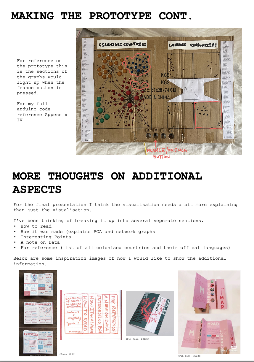
Designing and iterating on a physical visualisation concept that integrates LED lights and Arduino-controlled interactivity. Visualising the datasets in many different graphing structures.


User Testing
The user testing was split up into two separate sessions, one that focused on the initial visualisation and one that focused on how the LEDs enhanced the project.
Exhibition Setup
The final build and display was made to enhance audience engagement. The project was put in a less illuminated area to enhance the LEDs lighting and in turn project comprehension.
Watch the final build and design process below
The FInal Design
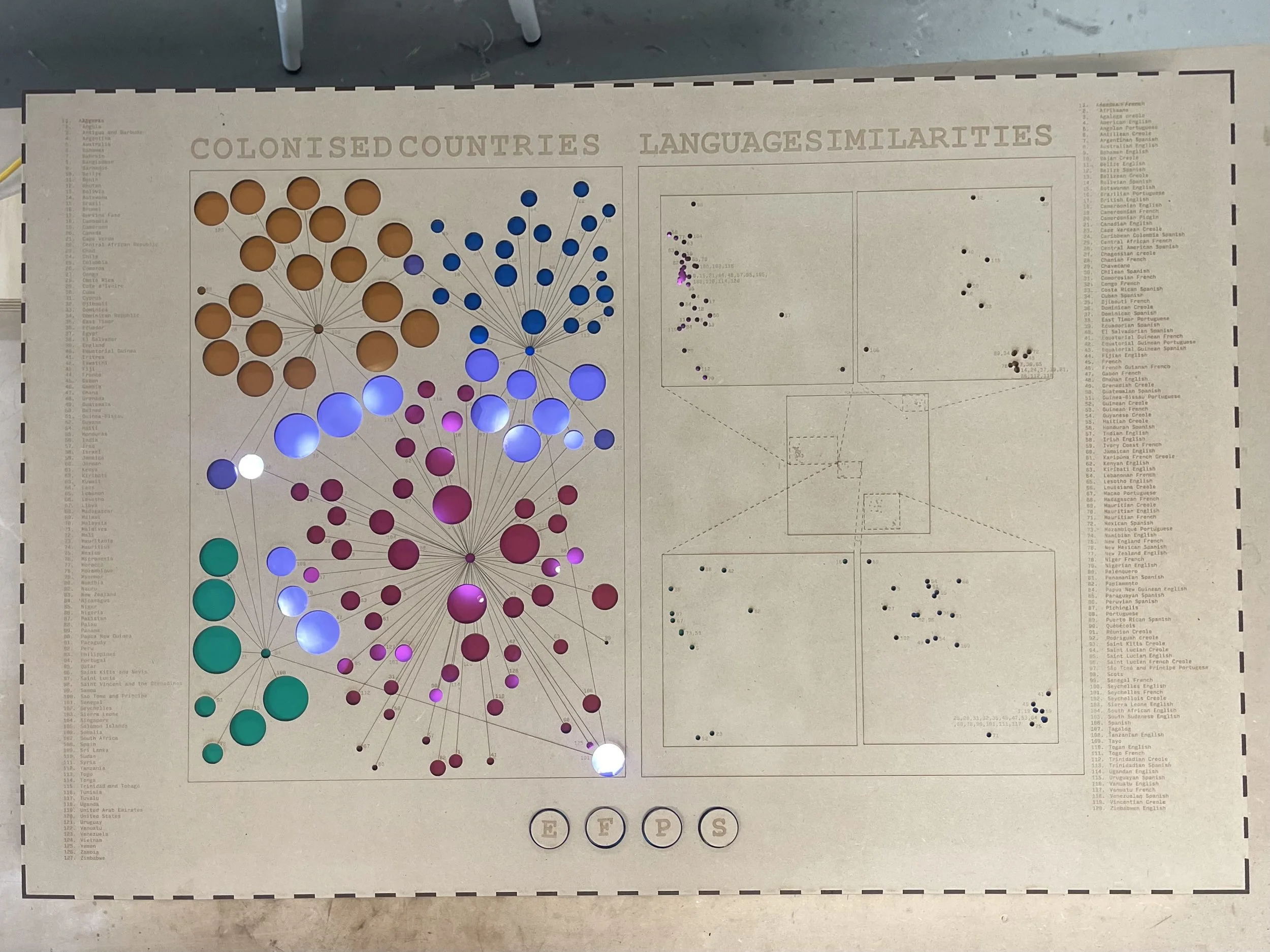
Network Graph
The Network Graph is made up of nodes and edges. Where the node represents a country and the edges represent the relationship between them. In this case the relationship is coloniser/colonised.
The node size is relational to the length of time the country was colonised for, so the larger the node the longer it was colonised for.
To find a colonising country look for the node which is surrounded connected to many nodes via the edges. Beside each node there is a reference number which can be cross referenced with the list to the right of the visualisation.
If a node has two edges connected to it, it has been colonised by two countries. Follow the edges to find the reference number and therefore coloniser.
-
The visualisation has four buttons. Each button represents a section of the visualisation. To light up and explore different parts of the visualisation press on any of the four buttons. E = England, F = France, P = Portugal, S = Spain
-
Throughout the visualisation it uses colour coding as well as lights to indicate what country or group the nodes are related to.
England and all countries colonised by it are red. All the different versions of English and English based creoles and pidgins are also red.
France, Portugal and Spain all follow the same pattern for their respective countries and related languages.
France is blue, Portugal is green and Spain is Orange.
Purple is the other colour used. It represents countries that where colonised by multiple countries within the graph.

PCA Scatter Plot
The PCA scatter plot shows how similar each language represented in the graph is to each other.
The closer the languages are the more similar they are based of the analysis. The initial scatter plot sits in the middle of the visualisation with exploded views of each section of the graph to make it easier to read.
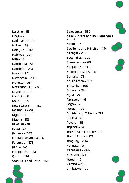
Each language has a reference number next to it which can be cross referenced with the list of languages on the left hand side.
For languages that are very similar, they overlapped and are unable to be differentiated and so the reference numbers are listed all together.

Exploring the project
The project is designed to allow users to explore at their own pace and draw their own conclusions from the data through engagement in a visual and interesting way. It allows users to go into in depth exploration, using both graphs to cross reference data, as well as guide on interaction booklet provided during the exhibition.
A note on data
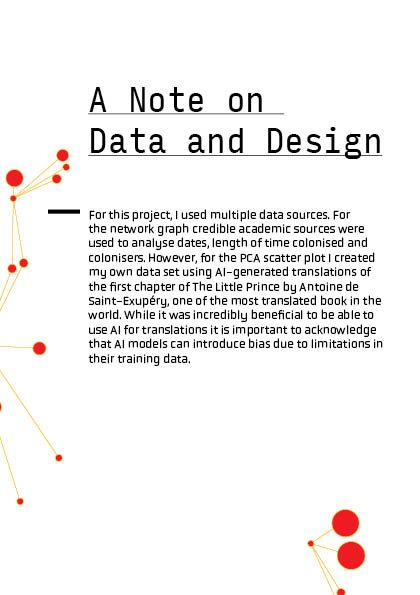
For this project, I used multiple data sources. For the network graph credible academic sources were used to analyse dates, length of time colonised and colonisers. However, for the PCA scatter plot I created my own data set using AI-generated translations of the first chapter of The Little Prince by Antoine de Saint-Exupéry, one of the most translated book in the world. While it was incredibly beneficial to be able to use AI for translations it is important to acknowledge that AI models can introduce bias due to limitations in their training data.
Data and Design
This project combines both data analysis and design, two industry’s that are increasingly intertwined, as both rely on extracting meaningful insights from complex information. As someone with a background in engineering studies and in my final year of interaction design, the intersection of these industries is an exciting space to work and design in. I hope that this project leverages both these fields into a cohesive experience that is informative, thought provoking and fun.
A booklet guide for the exhibition


Award Recognition
Echoes of Colonisation was honoured with the Portable Award, sponsored by Portable in recognition of a project that genuinely contributes to positive societal impact or change through design and/or technology.
As well as Interaction and Visual Design Memorial Commendation in recognition of innovative approach and careful attention to detail in development of capstone level project in interaction design.